I’ve long been skeptical of the QR code madness among marketers. Sure, I’ve read all sorts of numbers around QR code adoption–good and bad. But many of the studies still pin *understanding* (not adoption) of QR codes in the 30 percent range. So, I tend to think, as a rule, QR codes are pretty over-hyped among marketers.
Follow my logic for a moment. For any brand to be successful using QR codes, your customers would need to follow a few steps. 1) They would need to understand what a QR code is and how it works (see 30 percent number). 2) They would need to have a smartphone AND a QR code scanner on their phones (numbers of smart phone users have recently been identified around 50 percent–those with QR code readers is most likely a smaller percentage). 3) They would need to see the QR code AND be compelled enough to take 1-3 minutes to scan it and consume the content you’re driving them to. 4) Your content would need to be compelling enough to get them to take action–the ultimate end goal.
I might argue that’s an awfully damn tall order to get a customer to do steps 1-4 as outlined above. A DAMN tall order.
And that thinking is partially what drove my little experiment on Black Friday at the Mall of America.
You see, we’ve seen a number of examples of brands using the codes in their marketing efforts–so we know what the brands are thinking/hoping to achieve. But, what we haven’t seen a lot of is the user experience side of this equation and what that really looks like and means for brand awareness, loyalty and ultimately, purchase.
So, I took a page out of Tom Webster’s book and did my own work–a lesson he extolled at BlogWorld LA a few weeks ago.
My goal was simple: To look at the user experience side of QR codes on the biggest shopping day of the year (Black Friday) at the biggest mall in the U.S. (the Mall of America) and analyze the results and lay out some key learnings and lessons for brands considering using QR codes.
I looked at two key areas: Creativity and Execution. For the purposes of this experiment, I just looked at in-store signage at the Mall, even though I’m fully aware there are other executions that include QR codes (print advertising, for example). Just needed some focus.
I reviewed 9 brands at the Mall, plus the Mall of America itself since they were organizing a unique event centered around QR codes (more on that in a post later this week). And, I attempted to grade each brand, just so we could prioritize and put a bit of a “curve” around this experiment (as unscientific as that is).
Let’s get to it.
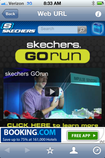
Sketchers
What I scanned:
Screen grab:
Creativity: No huge points for creativity here, but the code is part of a branded campaign on the Sketchers store-front.
Execution: First, the video the code links to is three-plus minutes. I don’t want to watch a three-minute video at home on my laptop, let alone on my mobile device. That’s just way too long. The video discusses the concept of “minimal shoes” and Sketchers take on that and their proprietary technology. Interesting stuff, but again, not worth three minutes of my time while I’m standing in front of your store.
Grade: B-
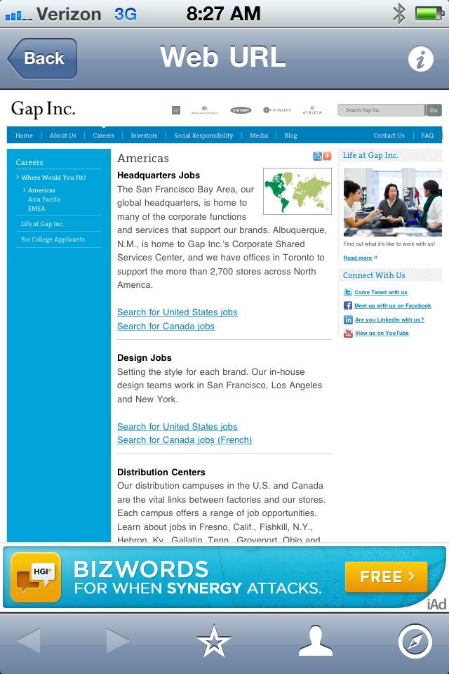
Old Navy
What I scanned:
Screen grab:
Creativity: Unique execution here, using QR codes as part of a larger holiday recruiting campaign for Old Navy. The signage was clear and easy to understand, and the QR code fit nicely into that package.
Execution: The scan took you directly to the Gap.com recruiting page, which featured corporate, design, warehouse and store positions. Pretty straightforward. The only thing I would have done differently here would be to direct people to a specific landing page with store-only positions. After all, that’s what they were seeking–why mess around with the corporate and design jobs, which fell right at the top of the page?
Grade: B+
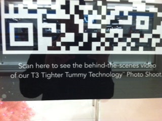
Lane Bryant
What I scanned:
Screen grab:
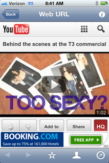
Creativity: Lane Bryant certainly isn’t the first brand to drive QR code scanners to a YouTube video. And they definitely aren’t the first to drive people to a “behind-the-scenes” video. Not many points for creativity here in my view.
Execution: The video is well done, and it’s short (under a minute). So, that piece works. But, the video doesn’t solve my problem, give me a deal/coupon or provide me other information I don’t already have. It’s merely a standard behind-the-scenes video starring some relatively attractive women without tops on (that was clearly their attention-getter).
Grade: C
Macys
What I scanned:
Screen grab:
Creativity: Admittedly, this sign was part of a promotion Macy’s unveiled a while ago. I was excited to see this in-store, but could only find a handful of these signs around. I’m guessing this “campaign” was over–yet, they still had the signs in store (foreshadowing alert!).
Execution: Anytime the folks scanning QR codes are taken to a landing page with the words “404–File Not Found”, well, that’s not a good thing. In fact, I think that qualifies as an unmitigated failure. I know the campaign is over, so why not take the signs down completely? More of an operations issue than anything, but part of a larger lesson for Macy’s.
Grade: F (I can’t not give them an F here–not trying to be harsh)
Columbia
What I scanned:
Screen grab:
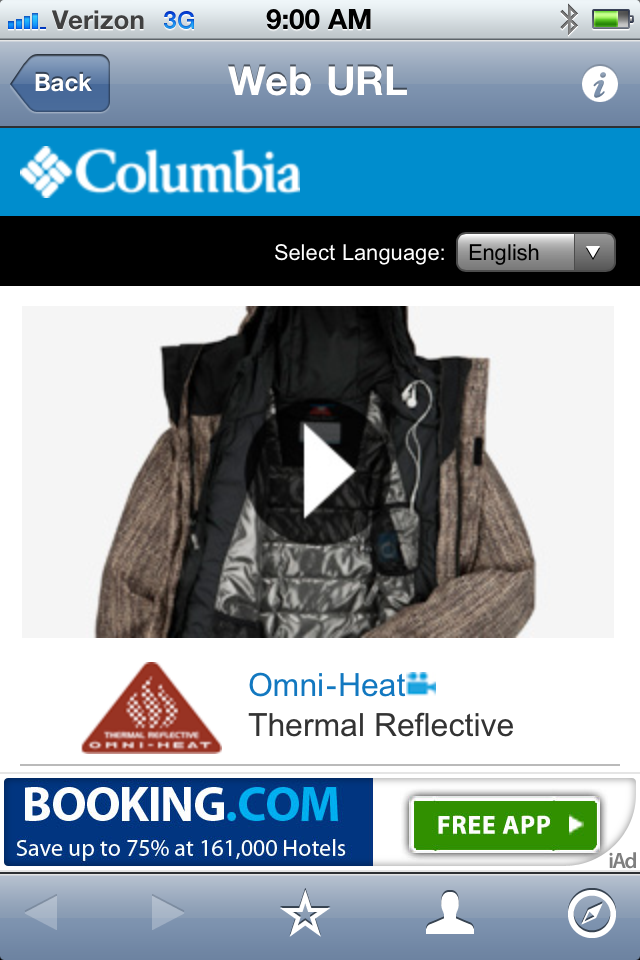
Creativity: The QR code on the Columbia store-front includes no mention of what to expect when I scan the code. No accompanying signage. Not any kid of explantation around what it is even, for the uninitiated.
Execution: The video’s actually not half-bad. It talks about a “body heat management system” (that’s too good to make up, folks) named “Omni Heat.” The video explains what Omni Heat is, and even includes a nice graphic that lays it all out. The rest of the video features young people engaging in outdoor activities (skiing, tubing), wearing Columbia gear with this Omni Heat layered in. Nothing unique here–but a nice explanation of the technology.
Grade: C-
Ultra Diamonds
What I scanned:
Screen grab:
Creativity: Not much creativity here–in the signage or the landing page. The signage does tell me I can expect a deal, but not much more.
Execution: Classic case of not planning for the execution. As you can see above, after I scanned the code, I was directed to a site that is clearly not optimized for mobile use. I can’t see the offers. I can’t even tell what site I’m on. If you’re going to take all the time to direct me to a site where I’m guessing I can actually buy your products, you better be damn sure it’s optimized for a mobile device to I can buy said product on my phone.
Grade: D
Roxy
What I scanned:
Screen grab:
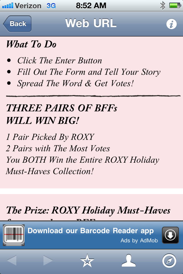
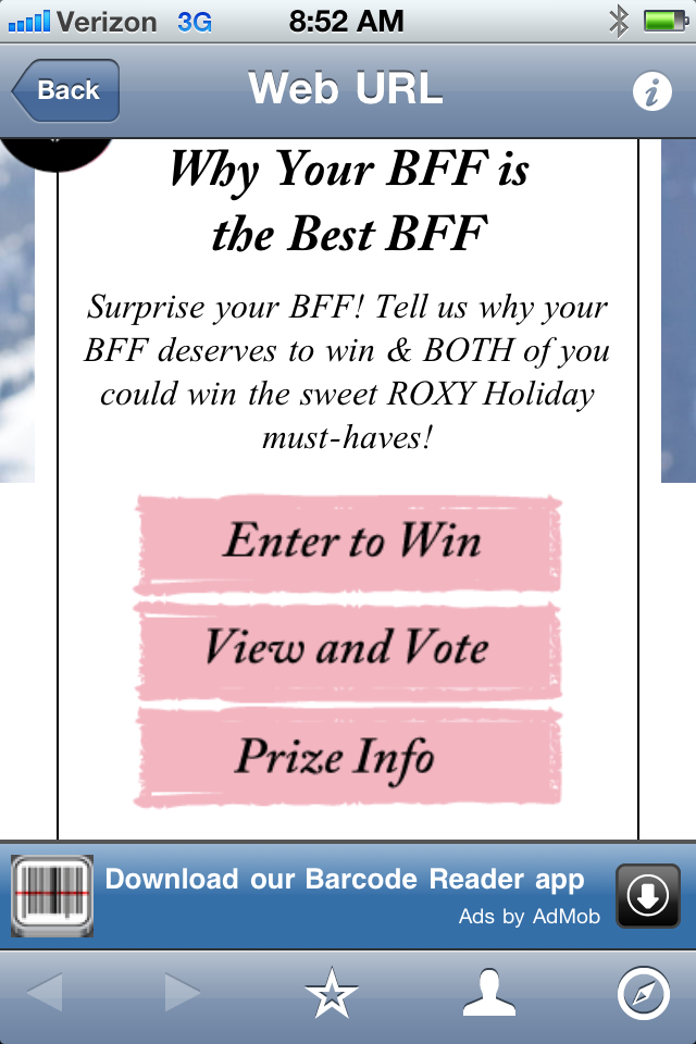
Creativity: The signage is clear, easy to understand and tells me exactly what I’m going to get when I scan the code. The idea behind the program is fairly straight-forward for a social program. Asking you to tell Roxy why you and your “BFF” deserve to win and encouraging you to get the word out. But, it was the only such program I saw affiliated with a QR code while at the Mall.
Execution: Here’s the thing with this idea–it’s just too hard and takes too much time for someone who just scanned the code standing outside your store-front. I mean, I like the idea. But, to ask someone to not only scan the code, but THEN to also fill out their name, email address, zip code, date of birth, and tell a story about why you and your BFF deserve to win (in less than 250 characters) is almost unrealistic. I’d be curious to know how many people have actually done this. I just think that’s a lot to ask of someone who’s standing outside your store on their phone.
Grade: C+
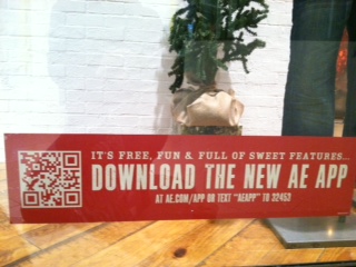
American Eagle
What I scanned:
Screen grab:
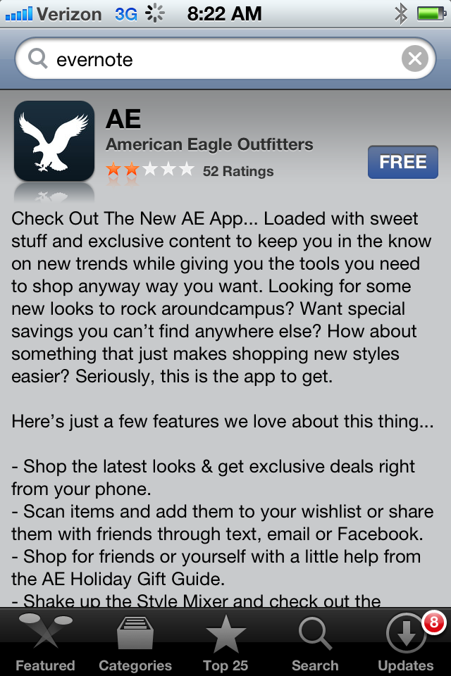
Creativity: No huge creativity point here. Just a straight-forward way to get customers to download the AE app for exclusive deals and content.
Execution: Not all that sexy, but I like this approach. I like that they tell customers exactly what they’ll get when they scan the code (the AE app). I like that the landing page tells you exactly what the app will deliver, including a bulleted list of all the relevant features. And, I really like the app itself (and I’m not even a AE shopper). It offers a rewards program, a “style mixer” program, mobile-only offers and it even offered me 20% off my first app purchase.
Grade: A-
SuperDry
What I scanned:
Screen grab:
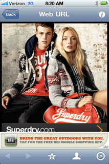
Creativity: The in-store signage is great, but it’s all about Facebook. The code is buried in the Facebook messaging. Now, that may be their point. Maybe they’re just using the code to direct people to their Facebook page. As you can see from the landing page, that doesn’t come across in the execution.
Execution: The landing page I was sent to was clean, easy to navigate and laid out very well for a mobile device. But, it doesn’t align with the signage and my initial point of contact. If they want people to “like” them on Facebook, why not just direct people straight to their Facebook page? Or, a landing page with a link to the Facebook page? Bit of a disconnect for me here, even though the landing page was well done technically.
Grade: C
The winners
American Eagle (using QR codes to get people to sign up for the AE app, which encourages e-commerce and loyalty)
Old Navy (using QR codes as part of a larger holiday recruiting strategy)
The losers
Macy’s (scan took me to a dead page)
Ultra Diamonds (scan took me to a site that wasn’t optimized for mobile devices)
Key lessons
* Make sure the site you’re driving customers to is optimized for mobile use. If it’s not, you’re wasting your time–and, more importantly, your customers.
* Think about the action you’re asking customers to take. Think about QR codes just like any other marketing tactic. What do you want people to do as a result of the effort? What’ the call to action? Is it clear? Is it easy to understand? Is it compelling?
* Make sure you set expectations clearly. Since there is such a lack of understanding around these codes, expectations must be crystal clear. I can’t over-emphasize this enough. Tell me what I’m going to get before I get it. And, then deliver. Make damn sure you deliever.
* Keep it simple. REALLY simple. Don’t get too cute with your QR code campaign. Instead, keep it straight-forward (see setting expectations above). The technology is complex enough–don’t ask your customers to do too much.










0 Comments