A few weeks ago, local PR colleague Tara Cegla turned me on to a new social media app/network named Path. Some of you may have heard of Path–it launched in Nov. 2010 and now has more than 300,000 members. In fact, Path has been on fire recently, picking 270,000 new users from Nov. 2011 to Dec. 2011.
Path is combination of Instagram, Facebook and Twitter (in a way). Founder David Morin claims it’s a “high quality social network.” High quality because it limits you to 150 friends–an interesting ripple. It’s also been called a “digital journal.” And, the Los Angeles Times called it a “modern day take on the Moleskin diary.”
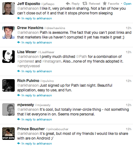
Here’s a sampling of what a number of folks had to say about Path on Twitter last week when I mentioned the network.
Interesting–but will Path be enough to lure folks away from Facebook, Instagram and other networks. Does it *need* to lure folks away from these other networks?
That’s been the challenge for Google Plus, it seems. Despite Google’s claims that the user base has grown tremendously the last quarter of 2011, the platform has yet to gain mainstream acceptance (and more *active* users). The main mantra we heard early on: Why do I need another social network? Or, better yet, what am I going to drop to spend more time on G+?
The answer–not many did (or have).
Or, consider the ideas of many of the people who commented on a post I wrote about Pinterest in December. The refrain I heard more times than one: I love Pinterest because it’s a site I can visit where I don’t have to think, or participate (like you would on Twitter, Facebook or G+).
My take: Most people don’t want more social networks. Even if they are “high quality.” They want simplicity. They want less–not more. Not to mention, it’s going to take a whole heckuva a lot of momentum to get people off Facebook and Twitter.
And that’s kinda why I think Path will achieve niche social network status, at best. It’s just not *that* different from any other social network. Sure, it’s clean. Yeah, it has a fantastic user experience (only applicable to folks in our industry). But, at the end of the day, there’s no compelling reason for me to use Path over Twitter or Facebook on a daily basis.
This is just one blogger’s opinion, mind you. Let’s ask a few other smart folks who I’ve connected with on Path about their thoughts on why they use the tool, the user experience and Path’s future:
Amanda Oleson, community manager, Magnet Street
For me, Path isn’t particularly time consuming, so it hasn’t been hard to find time to use it. The app itself works really well as far as loading, finding my location and updating quickly goes – unlike most of the other social apps I use. (I get really frustrated with Twitter, Foursquare and Facebook on my phone when they don’t load, find my location or let me update quickly.) I have kept my friends really limited on Path, so I’m not spending even five minutes searching through the stream to see what my friends are up to – which makes it really easy to fit into the time I have.
I find myself coming back to Path and using it for those same reasons. Obviously the ease of use is a huge plus. But I also really like the intimacy of the small circle of friends. It cuts out the noise that drives me crazy on Facebook and Twitter. Because Path auto-updates locations on the neighborhood level, my friends are the folks who I’m comfortable with knowing where I am all the time, which means that my stream tends to be more relevant to me than the massive ones full of people I barely know on Twitter and Facebook. On that same note, I feel more comfortable sharing things on Path because the people who can see it are my real friends.
Aaron Landry, chief operating officer, Kuokoa
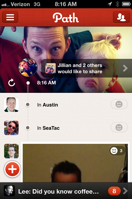
Path’s UI is clean, friendly, uses white space well, and to the point. They stripped away the stuff you don’t need. For example, you don’t see people’s names next to their avatars: you identify people from avatar only. Most of the places you’d think there should be a timestamp there isn’t; that’s taken care of the scrolling clock (on iOS, not Android). It’s smooth, fluid, and natural. Only the timeline, though. The process to do other activities such as adding friends, and going through settings and menus is not that different than any other application.
And finally, that little “+” at the bottom that gives you choices: essentially, every single one of those choices is a form of a check-in. It should just skip that choice and go straight to a check-in screen where you can choose from all the check-in parameters: what you’re thinking, where you are, what it looks like, what you’re listening to, who you’re with, and, well, if you just woke up or not. Why separate those out to a bunch of different screens where you can only do a certain parameters? I make the joke: when I do a “wake up” check-in, I should be able to indicate who I’m with.
Path as it’s own network I’m fairly leery about because it doesn’t provide anything unique other than limitations. Here’s an example from a recent trip to New York: https://twitter.com/#!/s4xton/status/148996343086587904
“Difference between Path & Foursquare: Foursquare got me free wine, a room upgrade, told me best bars. Path told me when my friends woke up.”
Imagine if someone created an application that aggregated your social networks such as Twitter, Facebook, Foursquare, Instagram, Last.fm, and maybe integrated with your FitBit or something. You could get all the music, wake-up, location, photo, and status-update stuff directly from your existing networks, then figure out a way to consolidate the duplicate content across networks (that’s the hard part), able to filter out stuff you should see towards the top – as well as view like a fire hose (something Facebook does well and Twitter does not), then throw an awesomely formatted timeline on that data. Think if Flipboard’s social feeds were in one string and read like a timeline? Why would anyone use Path? Wouldn’t that be awesome?
Greg Swan, vice president-digital, Weber Shandwick
Path has a beautiful user-experience and enables fluid sharing across the suite of popular social sites (Twitter, Facebook, Tumblr, FourSquare), but unlike emerging niche networks (e.g., Pinterest, Instagram and Quora), Path has yet to position itself with a differentiator strong enough to stand out against its all-purpose social network competition. I’m using Path to follow only close friends and colleagues with whom I have a real-world, tangible relationship. For now. I enjoy using it as a filter for this purpose, but frankly, I forget to check it day-to-day — thus further reinforcing the necessity for Path to better position its differentiation and strengths in such a cluttered space.
Tim Hayden, chief marketing officer, 44 Doors
I’m a big fan of Path for a few reasons:
* By limiting a user to 150 “Pathmates”, users are [most often] selective in both: with whom they share their Path; and, what type of content is shared. Naturally, the post/notification stream flowing past a user is cleaner, free from brand messaging and errant posts that pollute your Facebook and Twitter streams…AND, I love the intimate and discreet content and conversations that are being hosted in Path. Much of the discourse I’ve seen already is very personal, sometime private (sharing kids’ stories/photos, talking about a work issue, or better). All of this alone makes Path “the true Friend network” if it plays out for the masses as I’ve described above.
* The content emphasis in Path is on a user’s thoughts (“narrative”) and feelings (“discreet”). Location and beyond-Path social sharing are subtle and secondary options for users to narrate and share their posts.
* From a functionality standpoint, I see Path’s long-term success being fueled by what seems to me as borrowed “best of” attributes from Facebook, Instagram and Foursquare that work like a champ on BOTH Android and IOS devices (Amen). <– cross-platform: one of the top reasons why Path will be the biggest thorn in Instagram’s side in 2012.
From a UI standpoint:
* Path’s interface is cleaner, and softer than most other social-mobile apps. It reminds me of Gowalla’s early days, where I couldn’t help but smile at how the design was warm and intriguing, like art.
* Path seems to emulate the retro feel of Instagram, yet the narrative tools (emoticons: the way they look, the way you apply them to posts…) are added with two thumb strokes and abandon the need to force-imply a “like” or “favorite”
* Users learn intuitive visuals quicker with less text: 1) no names for users, just their profile pics are in the path-line (you don’t need names, as these are select close and “real” friends); 2) there is no link or address text issued with location-noted posts/check-ins.
* The “awake” and “sleep” settings are something many of us wish we had with other social networks, or just a simply on/off switch. This “operating hours” part of the user experience/control further makes Path a more personal network than Facebook, Twitter or Foursquare.
Shonali Burke, principal, Shonali Burke Consulting
What I like about Path is that, because my network on it is fairly small, it feels more intimate. As opposed to Twitter and Facebook, even LinkedIn, where I have fairly large networks, I’m more selective about who I add as a friend on Path. As a result, I feel more connected to the people I *am* friends with on Path, and I learn all sorts of th gas about that that I haven’t so far n the other networks.
Path is fairly quick and easy to plug into. You can post random thoughts, or photos, or whatever you like, but it doesn’t take a lot of time. And since it syncs with Twitter, Facebook, Foursquare and Tumblr (though I have only the first two set up), it’s easy to cross-post when I want.
Doug Hamlin, digital account executive, Weber Shandwick
The UX is definitely a driving factor in Path’s success, but that means more than just the interface you look at, beautiful as it may be; the whole experience is great from top to bottom. Three examples. The first is what is probably the defining feature of Path, the fact that it limits you to sharing only with your monkeysphere (the 150 people you actually know), which is refreshing to those of us who have felt pressured to blur the line of a what a friend is over the years.
Related is the fact that there are no brands on Path. A lot of us in digital marketing talk a lot about how people want to find their favorite brands on the social web. But if we presuppose that that’s not the case, then it looks like Path has a huge advantage. The services Path is aiming at — Foursquare, Instagram, Facebook — are all teeming with brands, while Path seems designed to keep them out. Now I don’t think we need to start worrying about the utility of social media as a marketing tool just yet, after all Facebook is still a behemoth compared to Path, and I do believe people will continue to want to see their favorite brands online as long as those brands are bringing some sort of value to their users. I do wonder, however, if we’ll start to see a split, where you just go to Path if you only want to know what your friends are up to and not what the soup of the day is at your neighborhood pub.
Finally, you can’t ignore the clean, simple interface, which is of course a function of the closed network. Simply put, Path can make a streamlined, beautiful experience because it doesn’t have a whole ecosystem of third-party apps that it needs to support (though this might be changing with their Nike+ integration), nor are there any kind of privacy controls. Facebook couldn’t copy Path if they wanted to without taking out a lot of the functionality users expect from it. I think Path is still in its minimum viable product stage. They will keep adding functionality to the app, but if they want to keep their experience advantage, they will have to balance each new function with how it affects the interface.
Steve Ladin, co-founder, Rock Your Block
I joined Path when they first launched over a year ago because I’m an emerging technology fiend. It was a bit clunky and lost my interest quickly. I’d say my top networks of choice are Twitter, Linkedin, Facebook and Foursquare. I’ve dabbled with Google+ and play around with GetGlue and Instagram when I can.
However, when Path 2.0 was launched, I immediately was drawn to the stunning design and dove back in for another lap. Path’s concept of playing off of Dunbar’s Number was very intriguing to me as it scratched my ongoing fascination with social graphs. The UX (User Experience) is like no other in mobile. Dave Morin and his team’s attention to detail to build upon the inadequacies of other platforms in the mobile space is sheer brilliance. I like the ability to share with my already existing larger networks (FB, Twitter, FS) as well make private when I want to. I’ve been using like a journal. I see future integration with the Sleep/Awake feature to a hardware device like Jawbone’s UP (when they get the bugs worked out on that) and just read they just closed a deal with Nike’s FuelBand for fitness buffs.
I believe Path is an innovator and one to take the lead in the “build for a remarkable user experience” model. You’re going to see big things to come from this company in the coming year. I can assure you of one thing, Path’s extraordinary essence has wafted its way towards me for inspiration.
Kurt Stafki, account executive, OLSON
I guess the third time is the charm for them, and the quality of the app is evidence they now know what they’re doing. The UI is second to none. It is clean, smooth and very visually appealing. The clutter-free feel is symbolic of Path’s principle, which is limiting your social network to only your close friends, not anyone and everyone like Twitter. The content delivery is Facebook’s timeline done right. Because your posts are generally auction-based — where you are, what song you are listening to, when you go to sleep, ect. — as you scroll back through your page, you are taken back through your digital life, essentially experiencing your path. I especially like watching the arms on the little clock turn back as you follow your path back in time.
Lee Odden, CEO, TopRank Marketing
As for Path, it has a unique interface and a niche feel to it where people share more personal info to a limited group. It’s for those reasons that I like it personally, but those characteristics are not exactly attractive for brand participation in my opinion. Path is in my “maybe” category for social / mobile apps. There’s simply too many features on Path that are available elsewhere, but more importantly, no built-in model for users to scale their participation or networks.


0 Comments